Interactive image comparison for Gutenberg
Kinetic Before After for visual proof that sells.
Show transformations, redesigns, restorations, photo edits, product improvements, and case study results with a polished Gutenberg before/after slider that visitors can drag, click, and explore.
Use cases
Show real transformations,
not just feature cards.
Before/after content works because it removes doubt. Instead of describing the
improvement, Kinetic Before After lets visitors drag through the result
and see the change for themselves.

Demo 01 / Photo Enhancement
Highlight subtle improvements with a cleaner reveal.
Use the slider for photo editing, product improvements, color grading, image restoration, packaging updates, and visual enhancement work. It helps visitors notice details that are easy to miss in separate images.
Demo 02 / Website Redesign
Perfect for redesign case studies.
Use Kinetic Before After to show how a page, brand, landing section, or digital interface improved from the original version to the final polished design. It is ideal for agencies, freelancers, portfolios, and client case studies.

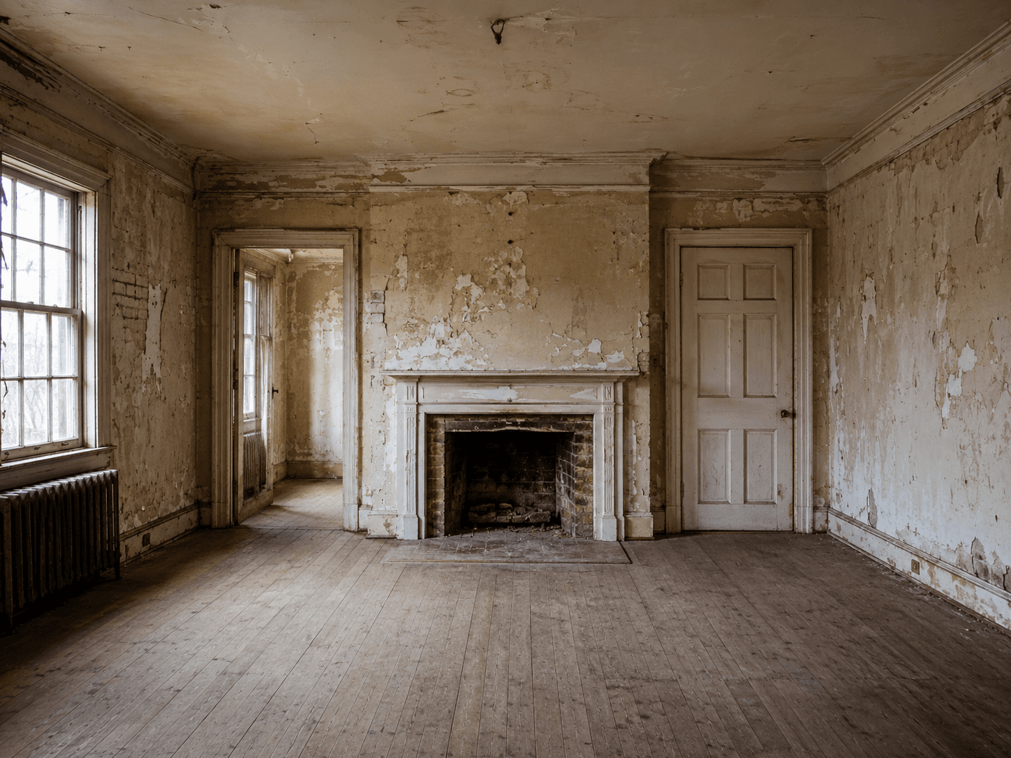
Demo 03 / Renovation & Restoration
Make physical transformations instantly clear.
Perfect for renovation, restoration, cleaning, repair, staging, and service businesses where the result is the strongest selling point. One slider can communicate the full value of the work faster than a long paragraph.
Why buy PRO
Before/after content is persuasive because it shows proof.
A comparison slider is one of the fastest ways to communicate improvement. Kinetic Before After PRO gives you more control over the reveal style, interaction behavior, mobile presentation, and visual polish.
Best for
Pages where the result needs to be seen.
Use it where the button deserves attention, not for every small text link.
Use cases
Use it anywhere comparison increases trust.
The block works best when visitors can understand the value of your work by sliding between the old state and the improved state.
Redesigns
Show old vs new website sections, landing pages, or UI improvements.
Renovations
Compare spaces before and after construction, staging, repair, or cleanup.
Photo Editing
Show retouching, color grading, restoration, or enhancement results
Product Upgrades
Compare previous and improved products, packaging, visuals, or features.
Case Studies
Give client work stronger visual proof in one interactive section.
Restoration
Show repair, cleaning, restoration, or treatment outcomes clearly.
Beauty / Fitness
Present transformation-style visual proof with labels and controlled layout.
Portfolios
Add interactive comparison blocks to agency, creative, and service portfolios.
Free vs PRO
Start with classic comparison. Upgrade for advanced reveal experiences.
KineticHub Free gives you the essential before/after image comparison workflow. KineticHub PRO unlocks advanced transitions, smarter interaction patterns, richer handles, mobile controls, and premium visual details.
| Feature | KineticHub Free | KineticHub PRO |
|---|---|---|
| Before and after image selection | Included | Included |
| Horizontal classic slider | Included | Included |
| Draggable handle and click-to-move | Included | Unlocked |
| Labels and hide-labels-on-move | Included | Included + more styling |
| Divider styles | Included | Unlocked |
| Aspect ratio controls | Auto, 16:9, 1:1, 4:3, 3:4 | Desktop + mobile aspect controls |
| After image filters | Included | Unlocked |
| Before image filters and overlays | Not included | Unlocked |
| Transition styles | Classic slide | Unlocked |
| Vertical orientation and reverse reveal | Not included | Unlocked |
| Smart addons | Not included | Inner parallax, hold-to-peek, cursor badge |
| Kinetic movement | Drag and click | Hover-to-slide, inertia, magnetic snap |
| Handle styles and pulse effects | Classic handle | Classic, minimal, text, pulse effects |
FAQ
Before/After questions before you build.
Use this FAQ section for SEO, sales clarity, and fewer pre-sale/support questions.
Kinetic Before After is a Gutenberg block for creating interactive before/after image comparisons inside WordPress.
Use it for website redesigns, photo editing results, renovations, restoration projects, product improvements, beauty or fitness transformations, repairs, and visual case studies.
Yes. You can show before and after labels, customize the label text, and hide labels while the slider is moving to keep the comparison area cleaner.
PRO adds advanced reveal styles, vertical orientation, reverse reveal, mobile aspect ratio controls, before image filters, custom label styling, handle styles, pulse effects, hover-to-slide, inertia, magnetic snap, inner parallax, hold-to-peek, and cursor badge behavior.
Yes. The slider handle uses semantic slider behavior, keyboard-friendly interaction, ARIA value updates, and reduced motion handling.
For best results, use before and after images with the same dimensions or crop ratio. Fixed aspect ratios can help keep the layout stable and visually aligned.