Sticky media storytelling for Gutenberg
Kinetic Split Scroll for premium visual stories.
Build split-screen WordPress sections where media stays pinned while content scrolls beside it. Perfect for product walkthroughs, case studies, service explanations, portfolio stories, and landing page narratives.
Pin the visual story.
The media column stays in view while the text column explains each part of the narrative.
Sync media with text.
Smart Media Swap can crossfade between images or videos as visitors move through the section.
Guide the scroll.
A vertical line progress indicator helps visitors understand where they are in the story.
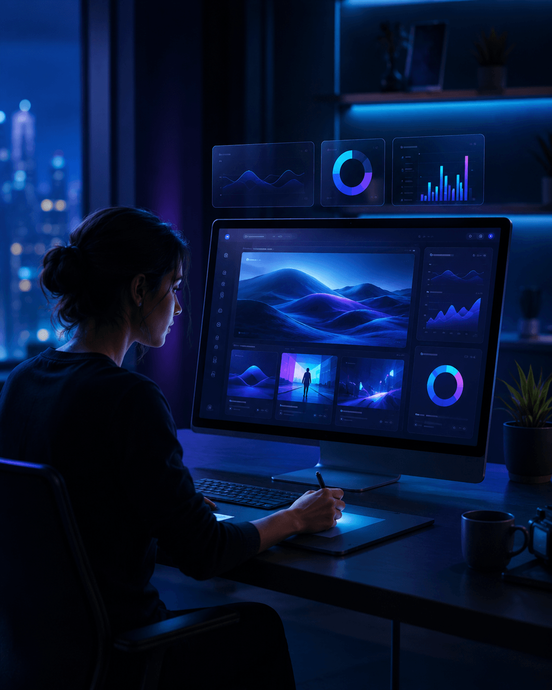
Split Scroll demo studio
Show a full storytelling layout,
not just a feature list.
Add the block, choose your media, write the content steps, and tune layout,
progress, overlay, and mobile settings directly in Gutenberg.


Product walkthrough
Explain a feature with matching media.
Pair each content section with a relevant image or video so the page feels guided and visual.
Case study
Keep the story moving while the visual stays anchored.
Use smart media swap to crossfade between project visuals as the visitor reads through the steps.
Service process
Turn long explanations into a structured scroll journey.
Use progress indicators, fade-up text, and mobile stacking controls to keep the experience readable.
Use one Split Scroll block as the page’s signature section.
This block sells best when visitors can feel the pinned-media storytelling pattern. Keep the demo focused: three content steps, three matching media items, and a clear progress indicator.
Product Tour
3 steps + 3 visuals
Case Study
Before, process, result
Service Flow
Discovery, build, launch
Portfolio Story
Concept, detail, outcome
Why buy PRO
Turn long sections into a guided visual experience.
Split Scroll is ideal when a normal text block feels too flat. It lets you explain a product, service, or project while keeping the supporting media visible and synchronized.
Best for
Sections where media and copy need to work together.
Use Split Scroll when visitors need context, sequence, and visuals at the same time.
Use cases
Use Split Scroll when a page needs a narrative.
The block works best when each content section has a matching visual
and the visitor should move through the story in order.
Product Tours
Explain features while visuals stay pinned beside the copy.
Case Studies
Show the problem, process, and outcome as a guided story.
Portfolio Pages
Present project details with synchronized screenshots or videos.
Service Pages
Break complex services into readable, visual steps.
Process Sections
Use scroll progression for discovery, design, build, and launch flows.
Feature Breakdowns
Pair benefit copy with focused product visuals.
Editorial Stories
Create magazine-style scrolling narratives inside Gutenberg.
Campaign Pages
Build higher-impact promotional sections for landing pages.
Free vs PRO
Start with split-screen storytelling. Upgradefor cinematic control.
KineticHub Free gives you the core pinned-media layout, smart media swap, responsive stacking, and progress line. KineticHub PRO unlocks advanced transitions, media masks, Ken Burns, parallax, glow, background morphing, extra indicators, and larger galleries.
| Feature | KineticHub Free | KineticHub PRO |
|---|---|---|
| Pinned media column + scrolling content column | Included | Included |
| Image and video media | Included | Included |
| Media gallery size | Up to 3 items | Up to 50 items |
| Smart media swap | Fade transition | Fade, wipe, circle, diagonal |
| Column ratio and pinned side | Included | Included |
| Sticky offset and mobile sticky toggle | Included | Included |
| Mobile stacking | Media first / text first | Unlocked |
| Image fit and image position | Not included | Unlocked |
| Overlay tint and pinned background | Not included | Unlocked |
| Progress indicator | Vertical line / none | Line, dots, percentage |
| Text effects | None, fade-up | None, fade-up, focus |
| Magnetic snap to content | Included | Included |
| Media shape masks | Not included | Floating, arch, tall pill |
| Ken Burns, inner parallax, ambient glow | Not included | Unlocked |
| Background morphing and advanced shadows | Not included | Unlocked |
| Visibility controls | Not included | Hide on mobile / desktop |
FAQ
Split Scroll questions before you build.
Use this FAQ section for SEO, sales clarity, and fewer pre-sale/support questions.
Kinetic Split Scroll is a Gutenberg block for creating split-screen scrolling sections with a pinned media column and a scrolling content column.
Use it for product walkthroughs, case studies, portfolio project stories, service explanations, step-by-step processes, feature breakdowns, editorial storytelling, and landing page narratives.
Yes. Kinetic Split Scroll supports image and video media in the pinned media column.
Smart Media Swap updates the pinned media as visitors scroll through the content column. In Free, the standard transition is a clean fade.
PRO adds larger media galleries, advanced swap transitions, pagination dots, floating percentage indicators, interactive dot navigation, media shape masks, Ken Burns, inner parallax, ambient glow, background morphing, focus text effect, custom shadows, and visibility controls.
The block supports mobile stacking with media-first or text-first order, and it includes an optional mobile sticky media setting.